
To find improvement opportunities, you look to the data. It offers the hard numbers that can help answer questions such as “Will we finish the work in time?” or “How can we adjust the process to improve flow?”
AgilePlace’s metrics and reports provide you with the data-driven insights you need to answer the tough questions. We’ve been overhauling our reporting engine to make our reports even faster and easier to use.
As the improvements gradually roll out, you’ll see the following enhancements:
- Improved performance: Generate and interact with your Planview AgilePlace reports more quickly
- Advanced sharing options: Communicate data points with your peers more easily
- Interactive reporting: Zoom in or out, and instantly include or exclude data ranges
Run Lean Reports More Quickly
With our new and improved reporting backend you can run your Planview AgilePlace reports with even more speed. This makes it much easier to change your report inputs, including: lanes, card types, dates, tags, and custom class icons and quickly re-run your report. This means no more waiting minutes for your reports to run — you’ll see them in seconds.
Share Insights with Your Colleagues
Communicate the right information to the right people using the new sharing options. Forward along the details of your reports by exporting images, PDFs, summary data sets, or underlying data sets. You’re now armed with functionality that fosters even more collaboration about the metrics that matter most.
Dig Into Your Data
A cleaner and more interactive user interface means the reports are easier to update, calibrate, and consume. The new reports allow you to highlight specific areas of data for focused views. Zoom in on specific data points and quickly compare calculations by including and/or excluding data. Update reports on-the-fly by selecting or deselecting lanes and additional criteria.
Four Enhanced Reports that Pack a Powerful Punch
Every action is recorded in Planview AgilePlace to generate metrics on cycle time, variability, efficiency, and workload distribution. These key metrics feed into four different reports to help provide you with insight into flow, predictability, and risk.
Speed
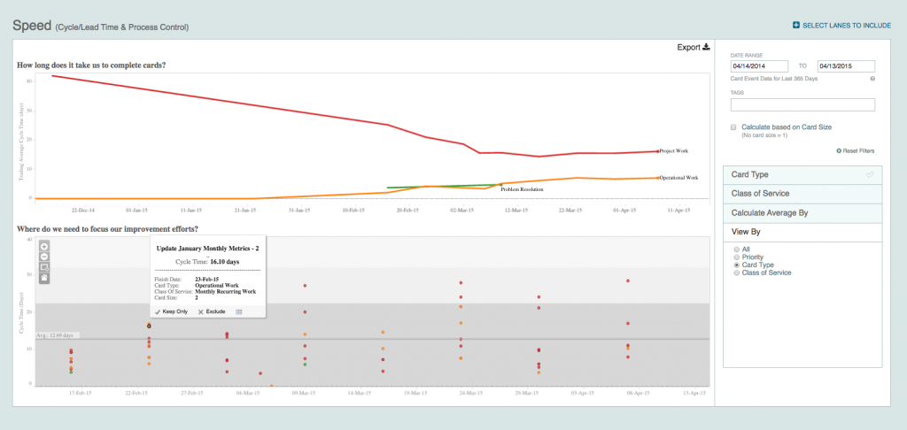
How long does it take us to complete cards?
In the cycle time report, you can see the average time that it takes to finish all of your work. Easily tailor your cycle time “clock” by selecting lanes to indicate where a card starts and finishes. Selecting multiple finish lanes allows you to see how long it takes work to get from the starting point to one of many places it may go from there. Zoom in to look at additional details and compare/contrast cycle times of different groups of work items by priority (e.g., to help monitor SLAs) and type of work (e.g., evaluate task card type versus defect card type).
Where do we need to focus our improvement efforts?
The process control chart looks at how consistently and predictably work is moving through your process. Each dot is a finished work item. You can see the average time that work takes, how widely dispersed it is, and how much variability there is in the process based upon three standard deviations. Additionally, lines embedded on the report indicate work that falls within both the 95% and 99% ranges to help you measure predictability with confidence.
Flow/Forecast
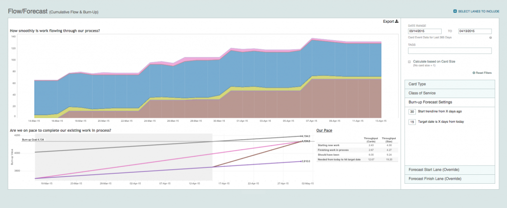
How smoothly is work flowing through our process?
Flow helps you visualize the amount of work in various states and stages of your process over time and the associated trends. With this information, quickly identify bottlenecks to improve your flow of value delivery. Customize your report by selecting which lanes to include in the analysis. In this report, view your WIP (X-axis) and mean cycle time (Y-axis) for any point in time over the past 365 days.
Are we on pace to complete our existing work in process?
To forecast effort, understand where efficiencies may be gained, and identify throughput (e.g., cards/day, story points/iteration), your burnup trajectory and pace details are available. This data enables you to answer questions such as “How much faster do we need to go in order to finish?” and “Are we adding too much work into the system?” Easily adjust the parameters of your projection to indicate how far into the future your target is and how far back to use trend data. With burnup trajectory, Planview AgilePlace takes the concept of the burndown chart a step further to provide accurate insights into the overall progress of your release or sprint.
Distribution
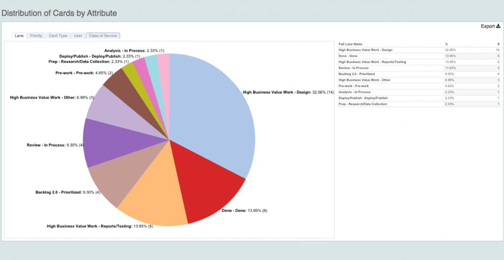
How is the work distributed across lane, priority, card type, user, and custom class?
Distribution shows the breakout of all of your work by both count and percentage of the whole. Quickly see work that’s unassigned and where you’re taking on too much work.
Efficiency
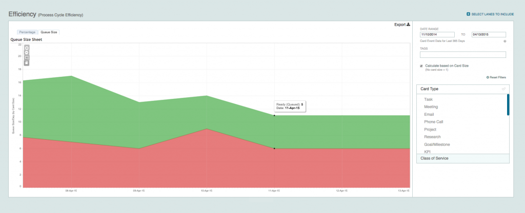
How are queues impacting our flow?
Managing queues is important because waiting contributes to and impacts your lead time. The efficiency diagram shows overall queued work and provides a measure of overall WIP (e.g., a tally of how many work items are currently on the board). By reviewing the expand-contract cycles on this chart, you can understand where queues are getting too large and may need WIP limits to improve flow efficiencies.
Tip: Tag lanes as “ready,” “in progress,” and “complete” in your board editor settings options to refine the information you see in this diagram.
Check out the New Reports
AgilePlace’s enhanced reporting functionality will be rolled out gradually and will automatically replace the current in-application reports. “How to” articles on these reports will be made available in our knowledge base.
Please contact us if you have questions about any of the new reports or if you’re interested in upgrading your account to start using reports that aren’t currently available to you.
Please note: Planview AgilePlace’s new reports are not supported by Internet Explorer 8 (IE8 and below). We’ll be working with customers that still use this browser to help minimize impact.
Recommended Reading
- Lean Metrics: Measure Predictability with Facts over Estimates by Chris Hefley
![A Global Collaborative Work Management Blueprint [Video]](https://blog.planview.com/wp-content/uploads/2019/07/A-Global-Collaborative-Work-management-blueprint.png)


