As solution marketing manager for Troux, I get to interact with a dynamic team of people – customers, prospects, our sales team and our product managers. I’ve had the privilege of working with product manager Dominique Trimino for quite some time now. She started with Troux 10 years ago as part of our documentation team and she knows the entire range of features Troux provides.
I recently sat down with Dominique to discuss some of the new features in Troux 12, particularly the visualization enhancements. Visualizations are important because they provide a picture of the data, underlying technology and interconnections within your enterprise architecture environment. In turn, visualizations help you make informed, important business decisions. Troux has some of the best visualization tools available, and with the release of Troux 12, we’ve made them even better, based on customer input.
So Dominique, in a nutshell, what visualization enhancements can be found in Troux 12?
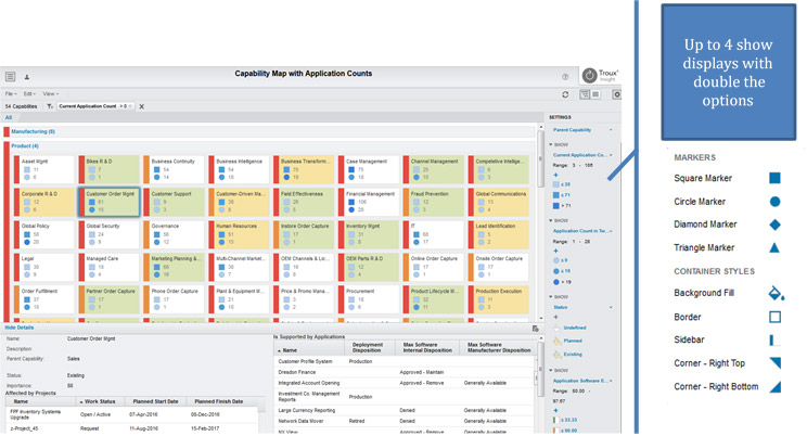
Dominique Trimino: “Well, in short, we’ve made the product smarter and easier to use. It’s smarter because it now remembers settings between sessions. And our visualizations are more user-friendly. We’ve included pop-up tooltips and extended the details pane throughout to help guide our users’ experience. With the hierarchy maps, we’ve included more markers to make data easier to see and explain. Now timelines can be used in more ways than before.”
What led to these enhancements?
“When many customers request similar things, we see it as an opportunity to add to our roadmap. With Troux 12, we adopted Planview’s Inner Circle joint development program, which was a terrific way to directly interact with our customers and involve them as we develop an enhancement. Recently, the most common request we received was about extending analysis beyond the core EA team. That is why you see enhancements around persistence, visualizations and tooltip support in this release.”
How are timelines different from previous versions?
“Prior to Troux 12, timelines only showed lifecycle information. Version 12 now supports date properties so components – like projects that capture planned start and finish dates – can be seen in a time-based view. In addition, users can choose colors to visualize additional attributes or highlight impact, scope or risk.”

You touched upon the hierarchy map earlier, and it’s an important visualization for our customers. What are they used for, and why are they useful?
“Visualizations, like the hierarchy map, play an important role in bringing together highly complex and interconnected information. EAs are aligning tangible technology details with business concepts, like capabilities and strategies. And hierarchy maps help make sense of that data. They’re a communication bridge between different business stakeholders, promoting transparency and stakeholder engagement.”
Can you give me an example?
“Sure. You can use the hierarchy map to visualize your business capabilities and identify all of the applications needed to support them, now and in the future.”
What benefits can customers expect from having more markers on the hierarchy maps?
“More information is summarized in one view. And you can compare and contrast information in more ways. For example, a hierarchy map could always show risk and cost information side-by-side, but now, you can overlay more information – such as importance or status – to provide additional context for decision-making.”
Those are some great improvements. We’ve made changes to the interactive details pane too. How will this add value to our customers’ experience?
“Customers will be able to get more detail on an application or technology in just one click. For example, if your visualization identifies application complexity, you can see the list of underlying or associated technologies – in one click, on the same page.”
I noticed that read-only viewers can now sort data table views in Troux Insight. How did that come about?
“Enhancement requests help me understand how our customers use our product and what they’re seeking. There’s been a recent trend among customers to allow more business users to access data by sharing Troux Insight perspectives. Troux Insight has supported read-only viewers for a while now, but because of customer feedback, we’ve expanded what they can do within a perspective. Now, read-only viewers can sort columns to rank items by a number of different criteria, like cost, importance or upcoming dates.”
When it comes to accurately envisioning your current and future EA environment, the answer is 12.


