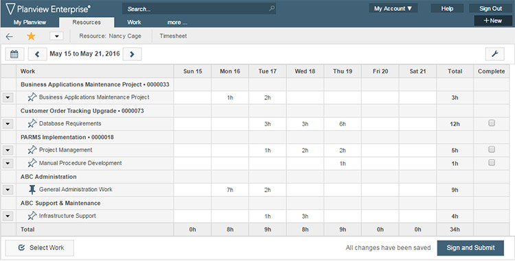
Of course, I’m talking about the new timesheet launched in Planview Enterprise 12, which we’re very excited about. While not everyone values timesheets as much as I do, in many ways, they are the unsung heroes of project portfolio management.
I realize individual timesheets will never be the focus of a boardroom discussion or a strategic decision, but data does provide a tremendous amount of foundational information; it supports everything from attributing project costs to re-estimating assignments. This data then flows to projects, programs and strategies to support critical decision-making throughout your organization.

But just as a skyscraper’s foundation doesn’t warrant the same level of attention as that of a penthouse on the 50th floor, it is critical in the support it provides. With that in mind and considering the timesheet is the most used page in Planview Enterprise, we focused on the user experience (UX). After all, it is imperative timesheets are simple and intuitive. If users don’t like the user interface (UI) or struggle to find the right work, compliance will fall and the quality of data will decline.
We didn’t start from scratch or work in isolation when thinking about the UX. As we have done over the past few years, we enlisted the input of our customers – who deserve much praise in helping this come together – through our Inner Circle program.
During the design process itself, we started by evaluating what worked well and what didn’t. With that insight, we focused on two key areas: rationalizing the overall timesheet UI and simplifying the select work process. Then we developed a series of mockups with our internal UX team and conducted a series of one-on-one sessions to test, iterate and retest various ideas. Once the general direction was laid out, our development team did a tremendous job pulling everything together and providing a preview environment for our timesheet Inner Circle. This environment allowed Inner Circle members to test pre-release versions of the timesheet throughout the development process, providing valuable insights that were then incorporated into the final design.
This level of collaboration and iteration truly helped, I have to say. The reaction to date has been beyond our expectations. Early comments include quotes such as “I love it!” and “Our [user] feedback has been great!”
Longer term, we expect the benefits of this simple, intuitive new timesheet to include reduced support costs and training as well as higher quality data and compliance. And so, the humble timesheet will continue its heroic efforts behind the scenes, quietly providing you with the data needed to accentuate your PMO. Here is more of what you can expect in Planview Enterprise 12.
What two elements are the unsung heroes portfolio management? Why the answer is 12 – Planview Enterprise 12 – and the new, improved timesheet of course.


![MassMutual Captures the Advances Enterprise Architecture Capabilities [Webinar]](https://blog.planview.com/wp-content/uploads/2018/08/MassMutual.gif)

